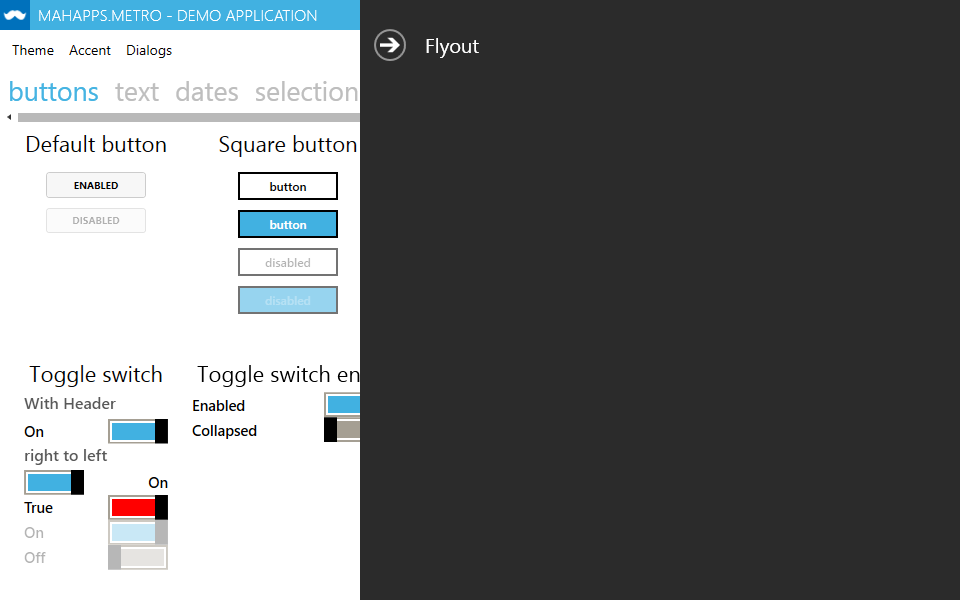
A Flyout is an overlay for the MetroWindow that can render custom contents.
It's derived from HeaderedContentControl and has the ability to slide in and out from any side of the window.
Note
It's strongly recommended to use any Flyout within the FlyoutsControl.
FlyoutsControl
The FlyoutsControl is an ItemsControl which contains all Flyout items for one MetroWindow. It must be assigned to the Flyouts property of the MetroWindow.
Example
The following Xaml code creates two Flyout controls with a header and the position on the right side of the window.
To open or close a Flyout set the IsOpen property or use a property on your ModelView at the DataContext of the window.
<mah:MetroWindow.Flyouts>
    <mah:FlyoutsControl>
      <mah:Flyout x:Name="FirstFlyout" Header="Settings" Position="Right" Width="250">
          <!-- The content goes here -->
      </mah:Flyout>

      <mah:Flyout Header="About" IsOpen="{Binding IsAboutFlyoutOpen}" Position="Right" Width="300">
          <!-- The content goes here -->
      </mah:Flyout>
    </mah:FlyoutsControl>
</mah:MetroWindow.Flyouts>
Position enum
Specifies the position fo the Flyout.
| Value | Description | |
|---|---|---|
| Left | 0 | Shows the Flyout on the left side. |
| Right | 1 | Shows the Flyout on the right side. |
| Top | 2 | Shows the Flyout on the top. |
| Bottom | 3 | Shows the Flyout on the bottom. |
FlyoutTheme enum
Specifies how a Flyout is being themed.
Fields
| Value | Description | |
|---|---|---|
| Adapt | 0 | Adapts the Flyout theme to the theme of the host window or application. |
| Inverse | 1 | Adapts the Flyout theme to the theme of the host window or application, but inverted. This theme can only be applied if the host window's theme abides the Dark and Light affix convention. |
| Dark | 2 | Use the dark theme for the Flyout. This is the default theme. |
| Light | 3 | Use the light theme for the Flyout. |
| Accent | 4 | The Flyout theme will match the host window's accent color. This option needs more action by the user, such as using the correct Foreground for the controls inside the Flyout. |
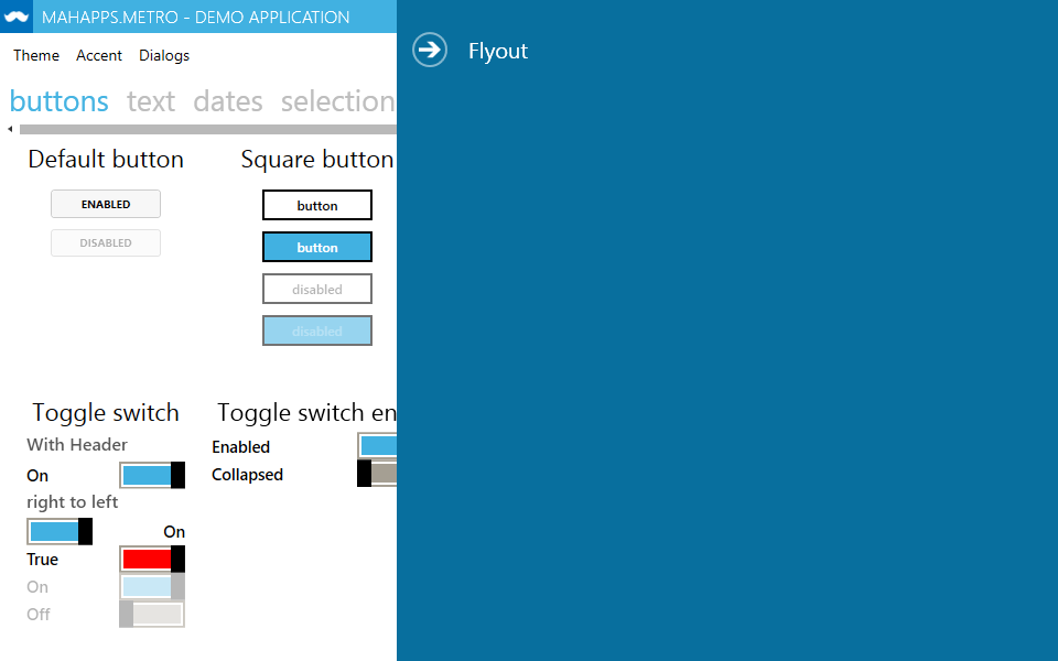
Overlay Behavior
The overlay behavior properties of the MetroWindow sets the visibility of the Icon, LeftWindowCommands, RightWindowCommands and WindowButtonCommands when a Flyout is shown.
MetroWindow Properties
| Property | Type | Description |
|---|---|---|
| LeftWindowCommandsOverlayBehavior | WindowCommandsOverlayBehavior | Gets or sets the overlay behavior for the WindowCommands on the left side of the title bar. |
| RightWindowCommandsOverlayBehavior | WindowCommandsOverlayBehavior | Gets or sets the overlay behavior for the WindowCommands on the right side of the title bar. |
| WindowButtonCommandsOverlayBehavior | OverlayBehavior | Gets or sets the overlay behavior for the WindowButtonCommands (Min / Max / Restore / Close) on the title bar. |
| IconOverlayBehavior | OverlayBehavior | Gets or sets the overlay behavior for the icon on the title bar. |
Note
The LeftWindowCommands, RightWindowCommands and the Icon will never be shown over an opened Flyout.
WindowCommandsOverlayBehavior enum
Specifies the visibility of the WindowCommands.
Fields
| Value | Description |
|---|---|
| Never | The WindowCommands will never be shown over a Flyout or hidden title bar. |
| HiddenTitleBar | The WindowCommands will be shown even if a title bar is hidden. |
OverlayBehavior enum
Specifies the visibility of the WindowButtonCommands (Min, Max/Restore and Close Buttons) and the Icon.
Fields
| Value | Description |
|---|---|
| Never | The WindowButtonCommands or the icon will never be shown over a Flyout or hidden title bar. |
| Flyouts | The WindowButtonCommands or the icon overlays all opened Flyout. |
| HiddenTitleBar | The WindowButtonCommands or the icon will be shown even if a title bar is hidden. |
| Always | The WindowButtonCommands or the icon will always be shown. |