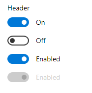
The ToggleSwitch control originally appeared in Windows Phone 7, but has made its way into Windows 8 and 10.
The MahApps.Metro version of this control uses the Windows 10 visuals (from Win SDK 10.0.18362).
The function is very similar to a CheckBox, but easier to differentiate and easier to use with touch interfaces.
It represents a switch that can be toggled between two states.
Use a ToggleSwitch control to let the user switch an option between on and off states. Use the IsOn property to determine the state of the switch. Handle the Toggled event to respond to changes in the state.

Example
This example shows how to set the Header, OnContent, and OffContent properties of a toggle switch. The Toggled event is handled to turn a ProgressRing control on or off.
<StackPanel Orientation="Horizontal">
  <mah:ToggleSwitch Header="Toggle Switch Sample"
                    OffContent="Do work"
                    OnContent="Working"
                    Toggled="ToggleSwitch_Toggled" />

  <mah:ProgressRing x:Name="progress" />
</StackPanel>
private void ToggleSwitch_Toggled(object sender, RoutedEventArgs e)
{
    ToggleSwitch toggleSwitch = sender as ToggleSwitch;
    if (toggleSwitch != null)
    {
        if (toggleSwitch.IsOn == true)
        {
            progress.IsActive = true;
            progress.Visibility = Visibility.Visible;
        }
        else
        {
            progress.IsActive = false;
            progress.Visibility = Visibility.Collapsed;
        }
    }
}
