The HamburgerMenu control provides an easy-to-use, side-bar menu which users can show or hide by using a Hamburger button. By tapping the icon, it opens up a side menu with a selection of options or additional pages.
The 3-line Hamburger menu icon, allows developers to pack more features into their apps or navigation. The tiny icon takes up a minimal amount of screen real estate and creates a clean, minimalist look.
Developers can place menu specific content, navigation, images, text or custom controls.
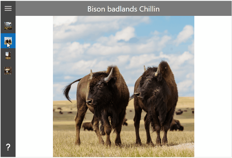
Example
Example Code
This sample demonstrates how to add custom menu items to the HamburgerMenu control.
<Controls:MetroWindow ...
                      xmlns:Controls="http://metro.mahapps.com/winfx/xaml/controls"
                      xmlns:iconPacks="http://metro.mahapps.com/winfx/xaml/iconpacks">

  <Controls:MetroWindow.Resources>
    <ResourceDictionary>

      <!--  Place for the DataTemplates for the menu items (see below)  -->

    </ResourceDictionary>
  </Controls:MetroWindow.Resources>

  <Controls:HamburgerMenu x:Name="HamburgerMenuControl"
                          DisplayMode="CompactOverlay"
                          HamburgerWidth="48"
                          ItemInvoked="HamburgerMenuControl_OnItemInvoked"
                          ItemTemplate="{StaticResource HamburgerMenuItem}"
                          OptionsItemTemplate="{StaticResource HamburgerOptionsMenuItem}">
    <!--  Header  -->
    <Controls:HamburgerMenu.HamburgerMenuHeaderTemplate>
      <DataTemplate>
        <TextBlock HorizontalAlignment="Center"
                   VerticalAlignment="Center"
                   FontSize="16"
                   Foreground="White"
                   Text="Pictures" />
      </DataTemplate>
    </Controls:HamburgerMenu.HamburgerMenuHeaderTemplate>

    <!--  Items  -->
    <Controls:HamburgerMenu.ItemsSource>
      <Controls:HamburgerMenuItemCollection>
        <Controls:HamburgerMenuGlyphItem Glyph="/Assets/Photos/BigFourSummerHeat.png" Label="Big four summer heat" />
        <Controls:HamburgerMenuGlyphItem Glyph="/Assets/Photos/BisonBadlandsChillin.png" Label="Bison badlands Chillin" />
        <Controls:HamburgerMenuGlyphItem Glyph="/Assets/Photos/GiantSlabInOregon.png" Label="Giant slab in Oregon" />
        <Controls:HamburgerMenuGlyphItem Glyph="/Assets/Photos/LakeAnnMushroom.png" Label="Lake Ann Mushroom" />
      </Controls:HamburgerMenuItemCollection>
    </Controls:HamburgerMenu.ItemsSource>

    <!--  Options  -->
    <Controls:HamburgerMenu.OptionsItemsSource>
      <Controls:HamburgerMenuItemCollection>

        <Controls:HamburgerMenuIconItem Label="About">
          <Controls:HamburgerMenuIconItem.Icon>
            <iconPacks:PackIconMaterial Width="22"
                                        Height="22"
                                        HorizontalAlignment="Center"
                                        VerticalAlignment="Center"
                                        Kind="Help" />
          </Controls:HamburgerMenuIconItem.Icon>
          <Controls:HamburgerMenuIconItem.Tag>
            <TextBlock HorizontalAlignment="Center"
                       VerticalAlignment="Center"
                       FontSize="28"
                       FontWeight="Bold">
                About
            </TextBlock>
          </Controls:HamburgerMenuIconItem.Tag>
        </Controls:HamburgerMenuIconItem>

      </Controls:HamburgerMenuItemCollection>
    </Controls:HamburgerMenu.OptionsItemsSource>

    <!--  Content  -->
    <Controls:HamburgerMenu.ContentTemplate>
      <DataTemplate>
        <Grid x:Name="ContentGrid">
          <Grid.RowDefinitions>
            <RowDefinition Height="48" />
            <RowDefinition />
          </Grid.RowDefinitions>
          <Border Grid.Row="0"
                  Margin="-1 0 -1 0"
                  Background="#7A7A7A">
            <TextBlock x:Name="Header"
                       HorizontalAlignment="Center"
                       VerticalAlignment="Center"
                       FontSize="24"
                       Foreground="White"
                       Text="{Binding Label}" />
          </Border>
          <Controls:TransitioningContentControl Grid.Row="1"
                                                Content="{Binding}"
                                                RestartTransitionOnContentChange="True"
                                                Transition="Default">

            <Controls:TransitioningContentControl.Resources>
              <DataTemplate DataType="{x:Type Controls:HamburgerMenuGlyphItem}">
                  <Image Source="{Binding Glyph, Mode=OneWay, Converter={converters:NullToUnsetValueConverter}}" />
              </DataTemplate>

              <DataTemplate DataType="{x:Type Controls:HamburgerMenuIconItem}">
                  <ContentControl Content="{Binding Tag, Mode=OneWay}"
                                  Focusable="True"
                                  IsTabStop="False" />
              </DataTemplate>
            </Controls:TransitioningContentControl.Resources>

          </Controls:TransitioningContentControl>
        </Grid>
      </DataTemplate>
    </Controls:HamburgerMenu.ContentTemplate>
  </Controls:HamburgerMenu>

</Controls:MetroWindow>
In order to render the items like in the sample above, you need to declare DataTemplate for both item types.
<Controls:MetroWindow.Resources>
  <ResourceDictionary>

    <!--  This is the template for all menu items. In this sample we use the glyph items.  -->
    <DataTemplate x:Key="HamburgerMenuItem" DataType="{x:Type Controls:HamburgerMenuGlyphItem}">
      <DockPanel Height="48" LastChildFill="True">
        <Grid x:Name="IconPart"
              Width="{Binding RelativeSource={RelativeSource AncestorType={x:Type Controls:HamburgerMenu}}, Path=CompactPaneLength}"
              DockPanel.Dock="Left">
          <Image Margin="12"
                 HorizontalAlignment="Center"
                 VerticalAlignment="Center"
                 Source="{Binding Glyph}" />
        </Grid>
        <TextBlock x:Name="TextPart"
                   VerticalAlignment="Center"
                   FontSize="16"
                   Text="{Binding Label}" />
      </DockPanel>
      <DataTemplate.Triggers>
        <DataTrigger Binding="{Binding RelativeSource={RelativeSource AncestorType={x:Type Controls:HamburgerMenu}}, Path=PanePlacement}" Value="Right">
          <Setter TargetName="IconPart" Property="DockPanel.Dock" Value="Right" />
          <Setter TargetName="TextPart" Property="Margin" Value="8 0 0 0" />
        </DataTrigger>
      </DataTemplate.Triggers>
    </DataTemplate>

    <!--  This is the template for the option menu item  -->
    <DataTemplate x:Key="HamburgerOptionsMenuItem" DataType="{x:Type Controls:HamburgerMenuIconItem}">
      <DockPanel Height="48" LastChildFill="True">
        <ContentControl x:Name="IconPart"
                        Width="{Binding RelativeSource={RelativeSource AncestorType={x:Type Controls:HamburgerMenu}}, Path=CompactPaneLength}"
                        Content="{Binding Icon}"
                        DockPanel.Dock="Left"
                        Focusable="False"
                        IsTabStop="False" />
        <TextBlock x:Name="TextPart"
                   VerticalAlignment="Center"
                   FontSize="16"
                   Text="{Binding Label}" />
      </DockPanel>
      <DataTemplate.Triggers>
        <DataTrigger Binding="{Binding RelativeSource={RelativeSource AncestorType={x:Type Controls:HamburgerMenu}}, Path=PanePlacement}" Value="Right">
          <Setter TargetName="IconPart" Property="DockPanel.Dock" Value="Right" />
          <Setter TargetName="TextPart" Property="Margin" Value="8 0 0 0" />
        </DataTrigger>
      </DataTemplate.Triggers>
    </DataTemplate>

  </ResourceDictionary>
</Controls:MetroWindow.Resources>
You can navigate to the items by using the following code.
private void HamburgerMenuControl_OnItemInvoked(object sender, HamburgerMenuItemInvokedEventArgs e)
{
  this.HamburgerMenuControl.Content = e.InvokedItem;

  if (!e.IsItemOptions && this.HamburgerMenuControl.IsPaneOpen)
  {
    // You can close the menu if an item was selected
    // this.HamburgerMenuControl.SetCurrentValue(HamburgerMenuControl.IsPaneOpenProperty, false);
  }
}
Properties
| Property | Type | Description |
|---|---|---|
| CanResizeOpenPane | bool | Gets or Sets whether the open pane can be resized by the user. The default value is false. |
| CompactPaneLength | double | Gets or sets the width of the pane when in its compact display mode. |
| ContentTransition | TransitionType |
Gets or sets the TransitionType for the TransitioningContentControl which shows the selected menu item content. |
| DisplayMode | SplitViewDisplayMode |
Gets or sets a value that specifies how the pane and content areas are shown. |
| HamburgerButtonHelpText | string | Gets or sets the AutomationProperties.HelpTextProperty for the HamburgerMenu button. |
| HamburgerButtonName | string | Gets or sets theAutomationProperties.NameProperty for the HamburgerMenu button. |
| HamburgerButtonStyle | Style | Gets or sets the FrameworkElement.Style for the HamburgerMenu button. |
| HamburgerButtonTemplate | DataTemplate | Gets or sets the ContentControl.ContentTemplate for the HamburgerMenu button. |
| HamburgerHeight | double | Gets or sets the FrameworkElement.Height for the HamburgerMenu button. |
| HamburgerMargin | Thickness | Gets or sets the margin for the HamburgerMenu button. |
| HamburgerMenuHeaderTemplate | DataTemplate | Gets or sets the ContentControl.ContentTemplate for the HamburgerMenu pane header. |
| HamburgerVisibility | Visibility | Gets or sets the UIElement.Visibility for the HamburgerMenu button. |
| HamburgerWidth | double | Gets or sets HamburgerMenu button's FrameworkElement.Width. |
| HeaderItemContainerStyle | Style | Gets or sets the Style used for each header item. |
| IsPaneOpen | bool | Gets or sets a value indicating whether the pane is expanded to its full width. |
| ItemCommand | ICommand | Gets or sets a ICommand which will be executed if an item was clicked by the user. |
| ItemCommandParameter | object | Gets or sets the ICommand parameter which will be passed by the ItemCommand. |
| ItemContainerStyle | Style | Gets or sets the Style used for each item. |
| ItemFocusVisualStyle | Style | Gets or sets the default FocusVisualStyle for a HamburgerMenuItem. This style can be override at the HamburgerMenuItem style by setting the FocusVisualStyle property. |
| Items | ItemCollection | Gets the collection used to generate the content of the items list. |
| ItemsSource | object | Gets or sets an object source used to generate the content of the menu. |
| ItemTemplate | DataTemplate | Gets or sets the DataTemplate used to display each item. |
| ItemTemplateSelector | DataTemplateSelector | Gets or sets the DataTemplateSelector used to display each item. |
| MaximumOpenPaneLength | double | Gets or sets the maximum width of the SplitView pane when it's fully expanded. |
| MinimumOpenPaneLength | double | Gets or sets the minimum width of the SplitView pane when it's fully expanded. |
| OpenPaneLength | double | Gets or sets the width of the pane when it's fully expanded. |
| OptionsItemCommand | ICommand | Gets or sets a ICommand which will be executed if an options item was clicked by the user. |
| OptionsItemCommandParameter | object | Gets or sets the ICommand parameter which will be passed by the OptionsItemCommand. |
| OptionsItemContainerStyle | Style | Gets or sets the Style used for each item in the options. |
| OptionsItems | ItemCollection | Gets the collection used to generate the content of the option list. |
| OptionsItemsSource | object | Gets or sets an object source used to generate the content of the options. |
| OptionsItemTemplate | DataTemplate | Gets or sets the DataTemplate used to display each item in the options. |
| OptionsItemTemplateSelector | DataTemplateSelector | Gets or sets the DataTemplateSelector used to display each item in the options. |
| OptionsVisibility | Visibility | Gets or sets the Visibility of the options menu. |
| PaneBackground | Brush | Gets or sets the Brush to apply to the background of the pane area of the HamburgerMenu. |
| PaneForeground | Brush | Gets or sets the Brush to apply to the foreground of the pane area of the HamburgerMenu. |
| PaneHeaderMargin | Thickness | Gets or sets the margin for the pane header. |
| PaneMargin | Thickness | Gets or sets the margin for the SplitView pane. |
| PanePlacement | SplitViewPanePlacement |
Gets or sets a value that specifies whether the pane is shown on the right or on left side of the HamburgerMenu. |
| ResizeThumbStyle | Style | Gets or Sets the Style for the resizing Thumb (type of MetroThumb) |
| SelectedIndex | int | Gets or sets the selected menu index. |
| SelectedItem | object | Gets or sets the selected menu item. |
| SelectedOptionsIndex | int | Gets or sets the selected options menu index. |
| SelectedOptionsItem | object | Gets or sets the selected options menu item. |
| SeparatorItemContainerStyle | Style | Gets or sets the Style used for each separator item. |
| ShowSelectionIndicator | bool | Gets or sets whether a selection indicator will be shown on the HamburgerMenuItem. |
| VerticalScrollBarOnLeftSide | bool | Gets or sets whether the ScrollBar of the HamburgerMenu is on the left side or on the right side of the menu items. |
Events
| Event | Description |
|---|---|
| HamburgerButtonClick | Event raised when the hamburger menu button is clicked |
| ItemClick | Event raised when an item is clicked |
| ItemInvoked | Event raised when an item is invoked |
| OptionsItemClick | Event raised when an options' item is clicked |
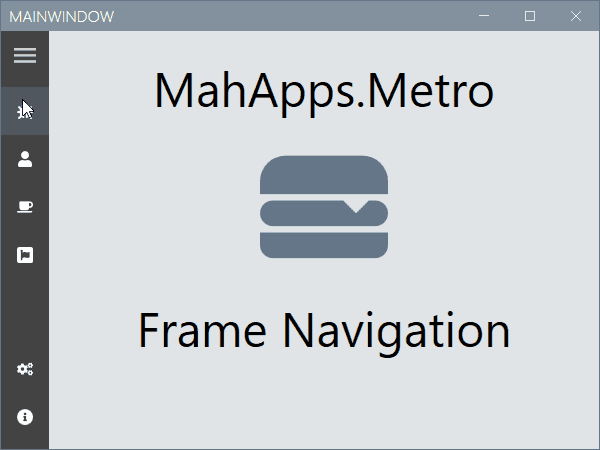
Navigation Example
Navigation Example Code
This sample demonstrates how to use the HamburgerMenu control with a Frame inside. The complete sample is available at this repository.
<controls:MetroWindow x:Class="MahAppsMetroHamburgerMenuNavigation.MainWindow"
xmlns="http://schemas.microsoft.com/winfx/2006/xaml/presentation"
xmlns:x="http://schemas.microsoft.com/winfx/2006/xaml"
xmlns:controls="http://metro.mahapps.com/winfx/xaml/controls"
xmlns:d="http://schemas.microsoft.com/expression/blend/2008"
xmlns:mc="http://schemas.openxmlformats.org/markup-compatibility/2006"
xmlns:viewModels="clr-namespace:MahAppsMetroHamburgerMenuNavigation.ViewModels"
Title="MainWindow"
Width="600"
Height="450"
GlowBrush="{DynamicResource MahApps.Brushes.AccentBase}"
WindowStartupLocation="CenterScreen"
WindowTransitionsEnabled="False"
mc:Ignorable="d">
<controls:MetroWindow.DataContext>
<viewModels:ShellViewModel />
</controls:MetroWindow.DataContext>
<controls:MetroWindow.LeftWindowCommands>
<controls:WindowCommands ShowSeparators="False">
<Button x:Name="GoBackButton"
Width="{Binding ElementName=HamburgerMenuControl, Path=CompactPaneLength}"
AutomationProperties.Name="Go back"
Click="GoBack_OnClick">
<controls:FontIcon AutomationProperties.Name="Go back icon"
FontSize="14"
Glyph="" />
</Button>
</controls:WindowCommands>
</controls:MetroWindow.LeftWindowCommands>
<controls:MetroWindow.Resources>
<DataTemplate x:Key="MenuItemTemplate" DataType="{x:Type viewModels:MenuItem}">
<Grid Height="48">
<Grid.ColumnDefinitions>
<ColumnDefinition Width="{Binding RelativeSource={RelativeSource AncestorType={x:Type controls:HamburgerMenu}}, Path=CompactPaneLength, Mode=OneWay}" />
<ColumnDefinition />
</Grid.ColumnDefinitions>
<ContentControl Grid.Column="0"
HorizontalAlignment="Center"
VerticalAlignment="Center"
Content="{Binding Icon}"
Focusable="False" />
<TextBlock Grid.Column="1"
VerticalAlignment="Center"
FontSize="16"
Text="{Binding Label}" />
</Grid>
</DataTemplate>
<Style BasedOn="{StaticResource {x:Type Frame}}" TargetType="{x:Type Frame}">
<Setter Property="Background" Value="{DynamicResource MahApps.Brushes.Accent4}" />
<Setter Property="ClipToBounds" Value="True" />
<Setter Property="ContentTemplate">
<Setter.Value>
<DataTemplate>
<controls:TransitioningContentControl Content="{Binding}"
RestartTransitionOnContentChange="True"
Transition="Custom">
<controls:TransitioningContentControl.CustomVisualStates>
<VisualState x:Name="CustomTransition">
<Storyboard>
<DoubleAnimationUsingKeyFrames BeginTime="00:00:00"
Storyboard.TargetName="CurrentContentPresentationSite"
Storyboard.TargetProperty="(UIElement.Opacity)">
<SplineDoubleKeyFrame KeyTime="00:00:00" Value="0" />
<SplineDoubleKeyFrame KeyTime="00:00:00.150" Value="1" />
</DoubleAnimationUsingKeyFrames>
<DoubleAnimationUsingKeyFrames BeginTime="00:00:00"
Storyboard.TargetName="CurrentContentPresentationSite"
Storyboard.TargetProperty="(UIElement.RenderTransform).(TransformGroup.Children)[3].(TranslateTransform.Y)">
<SplineDoubleKeyFrame KeyTime="00:00:00" Value="200" />
<SplineDoubleKeyFrame KeySpline="0.1, 0.9, 0.2, 1"
KeyTime="00:00:00.300"
Value="0" />
</DoubleAnimationUsingKeyFrames>
<DoubleAnimationUsingKeyFrames BeginTime="00:00:00"
Storyboard.TargetName="PreviousContentPresentationSite"
Storyboard.TargetProperty="(UIElement.Opacity)">
<SplineDoubleKeyFrame KeyTime="00:00:00" Value="0" />
</DoubleAnimationUsingKeyFrames>
</Storyboard>
</VisualState>
</controls:TransitioningContentControl.CustomVisualStates>
</controls:TransitioningContentControl>
</DataTemplate>
</Setter.Value>
</Setter>
</Style>
</controls:MetroWindow.Resources>
<controls:HamburgerMenu x:Name="HamburgerMenuControl"
DisplayMode="CompactInline"
IsPaneOpen="False"
ItemInvoked="HamburgerMenuControl_OnItemInvoked"
ItemTemplate="{StaticResource MenuItemTemplate}"
ItemsSource="{Binding Menu}"
OptionsItemTemplate="{StaticResource MenuItemTemplate}"
OptionsItemsSource="{Binding OptionsMenu}" />
</controls:MetroWindow>
Using this Frame object, you can navigate to your pages by using the following code.
using System;
using System.Linq;
using System.Windows;
using System.Windows.Navigation;
using MahApps.Metro.Controls;
using MenuItem = MahAppsMetroHamburgerMenuNavigation.ViewModels.MenuItem;

namespace MahAppsMetroHamburgerMenuNavigation
{
  /// <summary>
  /// Interaction logic for MainWindow.xaml
  /// </summary>
  public partial class MainWindow : MetroWindow
  {
    private readonly Navigation.NavigationServiceEx navigationServiceEx;

    public MainWindow()
    {
      this.InitializeComponent();

      this.navigationServiceEx = new Navigation.NavigationServiceEx();
      this.navigationServiceEx.Navigated += this.NavigationServiceEx_OnNavigated;
      this.HamburgerMenuControl.Content = this.navigationServiceEx.Frame;

      // Navigate to the home page.
      this.Loaded += (sender, args) => this.navigationServiceEx.Navigate(new Uri("Views/MainPage.xaml", UriKind.RelativeOrAbsolute));
    }

    private void HamburgerMenuControl_OnItemInvoked(object sender, HamburgerMenuItemInvokedEventArgs e)
    {
      if (e.InvokedItem is MenuItem menuItem && menuItem.IsNavigation)
      {
        this.navigationServiceEx.Navigate(menuItem.NavigationDestination);
      }
    }

    private void NavigationServiceEx_OnNavigated(object sender, NavigationEventArgs e)
    {
      // select the menu item
      this.HamburgerMenuControl.SelectedItem = this.HamburgerMenuControl
                                                   .Items
                                                   .OfType<MenuItem>()
                                                   .FirstOrDefault(x => x.NavigationDestination == e.Uri);
      this.HamburgerMenuControl.SelectedOptionsItem = this.HamburgerMenuControl
                                                          .OptionsItems
                                                          .OfType<MenuItem>()
                                                          .FirstOrDefault(x => x.NavigationDestination == e.Uri);

      // or when using the NavigationType on menu item
      // this.HamburgerMenuControl.SelectedItem = this.HamburgerMenuControl
      //                                              .Items
      //                                              .OfType<MenuItem>()
      //                                              .FirstOrDefault(x => x.NavigationType == e.Content?.GetType());
      // this.HamburgerMenuControl.SelectedOptionsItem = this.HamburgerMenuControl
      //                                                     .OptionsItems
      //                                                     .OfType<MenuItem>()
      //                                                     .FirstOrDefault(x => x.NavigationType == e.Content?.GetType());

      // update back button
      this.GoBackButton.Visibility = this.navigationServiceEx.CanGoBack ? Visibility.Visible : Visibility.Collapsed;
    }

    private void GoBack_OnClick(object sender, RoutedEventArgs e)
    {
      this.navigationServiceEx.GoBack();
    }
  }
}
The MenuItem is derived from the HamburgerMenuIconItem class and adds the NavigationDestination and NavigationType properties for this navigation sample.
using System;
using System.Windows;
using MahApps.Metro.Controls;

namespace MahAppsMetroHamburgerMenuNavigation.ViewModels
{
  public class MenuItem : HamburgerMenuIconItem
  {
    public static readonly DependencyProperty NavigationDestinationProperty = DependencyProperty.Register(
      nameof(NavigationDestination), typeof(Uri), typeof(MenuItem), new PropertyMetadata(default(Uri)));

    public Uri NavigationDestination
    {
      get => (Uri)this.GetValue(NavigationDestinationProperty);
      set => this.SetValue(NavigationDestinationProperty, value);
    }

    public static readonly DependencyProperty NavigationTypeProperty = DependencyProperty.Register(
      nameof(NavigationType), typeof(Type), typeof(MenuItem), new PropertyMetadata(default(Type)));

    public Type NavigationType
    {
      get => (Type)this.GetValue(NavigationTypeProperty);
      set => this.SetValue(NavigationTypeProperty, value);
    }

    public bool IsNavigation => this.NavigationDestination != null;
  }
}
The ShellViewModel defines the Items and OptionsItems for the HamburgerMenu. The BindableBase class implements the INotifyPropertyChanged with a helper method SetProperty. This sample uses the IconPacks NuGet package, so you need to add this to your project.
using System;
using System.Collections.ObjectModel;
using MahApps.Metro.IconPacks;
using MahAppsMetroHamburgerMenuNavigation.Mvvm;
using MahAppsMetroHamburgerMenuNavigation.Views;

namespace MahAppsMetroHamburgerMenuNavigation.ViewModels
{
  public class ShellViewModel : BindableBase
  {
    private static readonly ObservableCollection<MenuItem> AppMenu = new ObservableCollection<MenuItem>();
    private static readonly ObservableCollection<MenuItem> AppOptionsMenu = new ObservableCollection<MenuItem>();

    public ObservableCollection<MenuItem> Menu => AppMenu;

    public ObservableCollection<MenuItem> OptionsMenu => AppOptionsMenu;

    public ShellViewModel()
    {
      // Build the menus
      this.Menu.Add(new MenuItem()
                    {
                      Icon = new PackIconFontAwesome() { Kind = PackIconFontAwesomeKind.BugSolid },
                      Label = "Bugs",
                      NavigationType = typeof(BugsPage),
                      NavigationDestination = new Uri("Views/BugsPage.xaml", UriKind.RelativeOrAbsolute)
                    });
      this.Menu.Add(new MenuItem()
                    {
                      Icon = new PackIconFontAwesome() { Kind = PackIconFontAwesomeKind.UserSolid },
                      Label = "User",
                      NavigationType = typeof(UserPage),
                      NavigationDestination = new Uri("Views/UserPage.xaml", UriKind.RelativeOrAbsolute)
                    });
      this.Menu.Add(new MenuItem()
                    {
                      Icon = new PackIconFontAwesome() { Kind = PackIconFontAwesomeKind.CoffeeSolid },
                      Label = "Break",
                      NavigationType = typeof(BreakPage),
                      NavigationDestination = new Uri("Views/BreakPage.xaml", UriKind.RelativeOrAbsolute)
                    });
      this.Menu.Add(new MenuItem()
                    {
                      Icon = new PackIconFontAwesome() { Kind = PackIconFontAwesomeKind.FontAwesomeBrands },
                      Label = "Awesome",
                      NavigationType = typeof(AwesomePage),
                      NavigationDestination = new Uri("Views/AwesomePage.xaml", UriKind.RelativeOrAbsolute)
                    });

      this.OptionsMenu.Add(new MenuItem()
                           {
                             Icon = new PackIconFontAwesome() { Kind = PackIconFontAwesomeKind.CogsSolid },
                             Label = "Settings",
                             NavigationType = typeof(SettingsPage),
                             NavigationDestination = new Uri("Views/SettingsPage.xaml", UriKind.RelativeOrAbsolute)
                           });
      this.OptionsMenu.Add(new MenuItem()
                           {
                             Icon = new PackIconFontAwesome() { Kind = PackIconFontAwesomeKind.InfoCircleSolid },
                             Label = "About",
                             NavigationType = typeof(AboutPage),
                             NavigationDestination = new Uri("Views/AboutPage.xaml", UriKind.RelativeOrAbsolute)
                           });
    }
  }
}
The NavigationServiceEx is a helper class with a Frame to allow easy navigation in this sample.
using System;
using System.Windows.Controls;
using System.Windows.Navigation;

namespace MahAppsMetroHamburgerMenuNavigation.Navigation
{
  public class NavigationServiceEx
  {
    public event NavigatedEventHandler Navigated;

    public event NavigationFailedEventHandler NavigationFailed;

    private Frame _frame;

    public Frame Frame
    {
      get
      {
        if (this._frame == null)
        {
          this._frame = new Frame() { NavigationUIVisibility = NavigationUIVisibility.Hidden };
          this.RegisterFrameEvents();
        }

        return this._frame;
      }
      set
      {
        this.UnregisterFrameEvents();
        this._frame = value;
        this.RegisterFrameEvents();
      }
    }

    public bool CanGoBack => this.Frame.CanGoBack;

    public bool CanGoForward => this.Frame.CanGoForward;

    public void GoBack() => this.Frame.GoBack();

    public void GoForward() => this.Frame.GoForward();

    public bool Navigate(Uri sourcePageUri, object extraData = null)
    {
      if (this.Frame.CurrentSource != sourcePageUri)
      {
        return this.Frame.Navigate(sourcePageUri, extraData);
      }

      return false;
    }

    public bool Navigate(Type sourceType)
    {
      if (this.Frame.NavigationService?.Content?.GetType() != sourceType)
      {
        return this.Frame.Navigate(Activator.CreateInstance(sourceType));
      }

      return false;
    }

    private void RegisterFrameEvents()
    {
      if (this._frame != null)
      {
        this._frame.Navigated += this.Frame_Navigated;
        this._frame.NavigationFailed += this.Frame_NavigationFailed;
      }
    }

    private void UnregisterFrameEvents()
    {
      if (this._frame != null)
      {
        this._frame.Navigated -= this.Frame_Navigated;
        this._frame.NavigationFailed -= this.Frame_NavigationFailed;
      }
    }

    private void Frame_NavigationFailed(object sender, NavigationFailedEventArgs e) => this.NavigationFailed?.Invoke(sender, e);

    private void Frame_Navigated(object sender, NavigationEventArgs e) => this.Navigated?.Invoke(sender, e);
  }
}