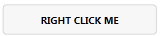
Default
This just replaces the standard button when you drop in the library, nothing fancy to activate it.
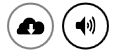
Circle
"Standard" circle button, designed for icons.
Add the following to a button to apply this style: Style="{DynamicResource MahApps.Styles.Button.Circle}"
Square
Another WP7 styled button, this time just for text. Like all the buttons here, has normal, clicked, and hover states.
Add the following to a button to apply this style: Style="{DynamicResource MahApps.Styles.Button.Square}"
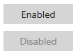
Accented Square
A slightly modified version of SquareButton that has the current accent color as background color.

Add the following to a button to apply this style: Style="{StaticResource MahApps.Styles.Button.Square.Accent}"
Flat
This sort of button can be found when you're making a call on Windows Phone - all of the controls (hang up, keypad, etc) are 'flat buttons'.
Flat button lives in
<ResourceDictionary Source="pack://application:,,,/MahApps.Metro;component/Styles/Controls.FlatButton.xaml" />
You'll need to import that as well to use it.