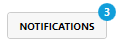
The Badged control renders a badge overlay on a given control.
The badge location can be set by the BadgePlacementMode property.
Examples
<mah:Badged Badge="42">
  <!-- Control to wrap goes here -->
  <Button Content="Notifications" />
</mah:Badged>
<mah:Badged Badge="{Binding Path=BadgeValue}" BadgePlacementMode="BottomRight">
  <!-- Control to wrap goes here -->
  <Button>
    <iconPacks:PackIconFontAwesome Kind="CommentOutline" />
  </Button>
</mah:Badged>
Note
The IconPacks control in the samples can be found here.
Properties
| Property | Type | Description |
|---|---|---|
| Badge | object | Gets or sets the Badge content to display. |
| BadgeBackground | Brush | Gets or sets the background brush for the Badge. |
| BadgeForeground | Brush | Gets or sets the foreground brush for the Badge. |
| BadgePlacementMode | BadgePlacementMode | Gets or sets the placement of the Badge relative to its content. |
| BadgeMargin | Thickness | Gets or sets a margin which can be used to make minor adjustments to the placement of the Badge. |
| IsBadgeSet | bool (readonly) | Indicates whether the Badge has content to display. |
| BadgeChanged | RoutedEvent | Occurs if the Badge property was changed. |
BadgePlacementMode enum
Specifies the position of the badge.
Fields
| Value | Description | |
|---|---|---|
| TopLeft | 0 | Shows the badge on the top left corner. |
| Top | 1 | Shows the badge on top. |
| TopRight | 2 | Shows the badge on the top right corner. |
| Right | 3 | Shows the bage on the right side. |
| BottomRight | 4 | Shows the badge on the bottom right corner. |
| Bottom | 5 | Shows the badge on bottom. |
| BottomLeft | 6 | Shows the badge on the bottom left corner. |
| Left | 7 | Shows the badge on the left side. |