Table of content
Introduction
The MultiSelectionComboBox is like a normal ComboBox, but instead of limit the selection to one item, the user is allowed to select multiple items.
The user interface

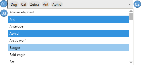
| No. | Description |
|---|---|
| 01 | Displays the selected item(s), or, if the control is in editable mode, a TextBox representing a concatenated string |
| 02 | This button opens or closes the DrowDown (No. 03) |
| 03 | A DropDown which displays all available items. Selected items are highlighted (blue background in the sample image) |
Common Properties
This control has all properties which are known from the normal ComboBox and in addition the following properties.
| Property | Type | Description |
|---|---|---|
| AcceptsReturn | bool | Gets or sets if the TextBox accepts return (editable mode only) |
| DisabledPopupOverlayContent | object? | Gets or sets the content to render above the DropDown when the DropDown is disabled (more) |
| DisabledPopupOverlayContentTemplate | DataTemplate? | Gets or sets the DataTemplate to render above the DropDown when the control has custom text (more) |
| DropDownFooterContent | object? | Gets or sets the content of the DropDown footer |
| DropDownFooterContentStringFormat | string? | Gets or sets the string format of the DropDown footer |
| DropDownFooterContentTemplate | DataTemplate? | Gets or sets the DataTemplate for the DropDown footer content |
| DropDownFooterContentTemplateSelector | DataTemplateSelector? | Gets or sets the DataTemplateSelector for the DropDown footer content |
| DropDownHeaderContent | object? | Gets or sets the content of the DropDown header |
| DropDownHeaderContentStringFormat | string? | Gets or sets the string format of the DropDown header |
| DropDownHeaderContentTemplate | DataTemplate? | Gets or sets the DataTemplate for the DropDown header content |
| DropDownHeaderContentTemplateSelector | DataTemplateSelector? | Gets or sets the DataTemplateSelector for the DropDown header content |
| EditableTextStringComparision | StringComparison | Gets or Sets the StringComparison that is used to check if the entered text matches to the SelectedItems |
| HasCustomText | bool | Indicates if the text is user defined. This property is read-only |
| InterceptKeyboardSelection | bool | Gets or sets if the user can select items from the keyboard, e.g. with the ▲ ▼ Keys. This property is only applied when the SelectionMode is Single. |
| InterceptMouseWheelSelection | bool | Gets or sets if the user can select items by mouse wheel. This property is only applied when the SelectionMode is Single. |
| IsDropDownFooterVisible | bool | Gets or sets if the footer in the DropDown is visible |
| IsDropDownHeaderVisible | bool | Gets or sets if the header in the DropDown is visible |
| ObjectToStringComparer | ICompareObjectToString? | Gets or sets a function that is used to check if the entered text matches an object that should be selected (more) |
| OrderSelectedItemsBy | SelectedItemsOrderType | Gets or sets how the SelectedItems should be sorted (more). |
| SelectedItemContainerStyle | Style? | Gets or sets the Style that is applied to the selected items |
| SelectedItemContainerStyleSelector | StyleSelector? | Gets or sets the StyleSelector that is applied to the selected items |
| SelectedItems | IList? | Gets a read-only list which holds the currently selected items. |
| SelectedItemsPanelTemplate | ItemsPanelTemplate? | Gets or sets the template that defines the Panel that controls the layout of the selected items. |
| SelectedItemStringFormat | string? | Gets or sets how to format the selected items if they are displayed as strings. |
| SelectedItemTemplate | DataTemplate? | Gets or sets the DataTemplate used to display the SelcetedItems |
| SelectedItemTemplateSelector | DataTemplateSelector? | Gets or sets the DataTemplateSelector for the selected items |
| SelectionMode | SelectionMode | Gets or sets the SelectionMode |
| SelectItemsFromTextInputDelay | int | Gets or Sets the delay in milliseconds to wait before the selection is updated during text input. If this value is -1 the selection will not be updated during text input. Note: You also need to set an ObjectToStringComparer to get this to work. |
| Separator | string? | Gets or sets the separator which will be used if the MultiSelectionComboBox is editable. |
| StringToObjectParser | IParseStringToObject? | Gets or sets a parser-class that implements IParseStringToObject (more) |
Styles
MultiSelectionComboBox-Styles
MahApps ships two build in styles for this control.
The default style (MahApps.Styles.MultiSelectionComboBox) wraps the selected items, if not all fits into a single line:

If you want a single line you can use MahApps.Styles.MultiSelectionComboBox.Horizontal which will show a horizontal ScrollViewer, if not all items fit into the available space.

ItemContainer-Styles
MahApps ships two build in styles for the item container visible when the DropDown is open.
The default style (MahApps.Styles.MultiSelectionComboBoxItem) looks like the one from the normal ComboBox.
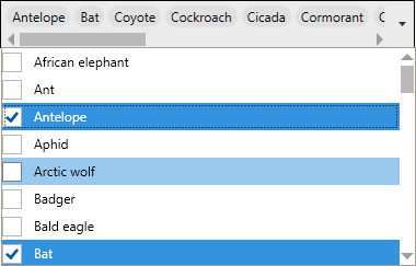
If you want to present CheckBoxes to the user you can use the MahApps.Styles.MultiSelectionComboBoxItem.CheckBox style:

SelectedItemContainer-Styles
Also for this MahApps ships two build in styles. Please note that these are only applied if IsEditable=false.
The default one wraps each item in a nugget like container:

If you want to provide an option to remove from the selected items you can use MahApps.Styles.MulitselectionComboBoxSelectedItem.Removeable which will add a delete button next to each item:

Selection
SelectionMode
The MultiSelectionComboBox supports all SelectionModes which are known from other controls with multi selection support (for example ListBox).
SelectedItemsOrder
This enum defines how the selected items should be presented to the user. The following values are possible:
| Value | Description |
|---|---|
| SelectedOrder | Displays the selected items in the same order as they were selected |
| ItemsSourceOrder | Displays the selected items in the same order as they are stored in the ItemsSource |
Text processing
Separator
The Separator is used to concatenate the selected items into one single string. if the text comes from user input, the Separator is also used to split the input string into fragments which will be used to select the requested items.
Note:
Take care which Separator to use. Ideally it should not be a valid (sub)-string of your items, as this may mess up with selection.
Custom text
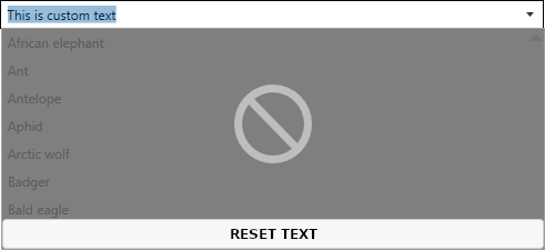
If the text entered into the editable TextBox does not match the string representation of the SelectedItems, the DropDown will show an overlay above the Items and will disable selection. This will prevent loss any user input. The property HasCustomText will be set to true in this case.

Build-in overlay
Customize the overlay
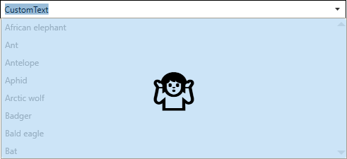
If you don't like the build-in overlay, you can roll your own as shown below.
<mah:MultiSelectionComboBox ItemsSource="{Binding Animals}"
                            IsEditable="True"
                            Text="CustomText" >
    <mah:MultiSelectionComboBox.DisabledPopupOverlayContentTemplate>
        <DataTemplate>
            <!-- Note: mah:MultiSelectionComboBox.ClearContentCommand will reset the text to match the SelectedItems representation if executed -->
            <Button Background="{DynamicResource MahApps.Brushes.Accent4}"
                    BorderThickness="0"
                    Command="{x:Static mah:MultiSelectionComboBox.ClearContentCommand}">
                <TextBlock Text="🤷"
                           VerticalAlignment="Center"
                           HorizontalAlignment="Center"
                           FontSize="50" />
            </Button>
        </DataTemplate>
    </mah:MultiSelectionComboBox.DisabledPopupOverlayContentTemplate>
</mah:MultiSelectionComboBox>
The result will look like this:

Selecting items from text input
If the control is editable and you have set a ObjectToStringComparer, the MultiSelectionComboBox will try to select the items from the user input. The build-in comparer will compare the input string fragments with the objects string representation while taking the StringComparison into account.
Basic Example
<!--
    - The Separator must be defined for automatic item selection.
    - The SelectItemsFromTextInputDelay is optional. If it is set to -1,
      it means the items will be selected only after LostFocus.
    - The EditableTextStringComparision is optional.
    - We use the build in comparer (DefaultObjectToStringComparer), but you can also use your own.
-->

<mah:MultiSelectionComboBox ItemsSource="{Binding Animals}"
                            SelectionMode="Multiple"
                            IsEditable="True"
                            Separator=", "
                            SelectItemsFromTextInputDelay="200"
                            EditableTextStringComparision="OrdinalIgnoreCase"
                            ObjectToStringComparer="{mah:DefaultObjectToStringComparer}" />
Custom ObjectToStringComparer Example
You can use any class that implements the ICompareObjectToString interface to compare your items to the entered text. For this example lets assume you have the following class User where you want to select the items by Userame or MailAddress.
public class User
{
    public string Username {get; set;}
    public string Name {get; set;}
    public string GivenName {get; set;}
    public string MailAddress {get; set;}
}
We can now implement the interface as shown below:
public class MyUserToStringComparer : ICompareObjectToString
{
    // This function is expected to be implemented. Returns true if the item matches, otherise false.
    public bool CheckIfStringMatchesObject(
        string? input,                      // The text fragment to test
        object? objectToCompare,            // The item to test for match
        StringComparison stringComparison,  // The string comparison to use
        string? stringFormat)               // The string format to use
    {
        // we cast the object to compare to a user.
        var user = objectToCompare as User;

        // if the input is null or the user is null we return false.
        if (input is null || user is null)
        {
            return false;
        }

        // If either the Username or the MailAddress matches the provided
        // input string we return true, otherwise we return false.
        return input.Equals(user.Username, stringComparison)
               || input.Equals(user.MailAddress, stringComparison);
    }
}
Adding new items from text input
If the control is editable and you have set a StringToObjectParser, the MultiSelectionComboBox will try to create a new item if the item was not found (see Selecting items from text input). The build-in parser will try to use reflection to create a new item from the input string, but you can also provide your own implementation.
Basic Example
<mah:MultiSelectionComboBox ItemsSource="{Binding Animals}"
                            SelectionMode="Multiple"
                            IsEditable="True"
                            Separator=", "
                            SelectItemsFromTextInputDelay="200"
                            EditableTextStringComparision="OrdinalIgnoreCase"
                            ObjectToStringComparer="{mah:DefaultObjectToStringComparer}"
                            StringToObjectParser="{x:Static mah:DefaultStringToObjectParser.Instance}" />
Custom StringToObjectParser Example
You can use any class that implements the IParseStringToObject interface to parse the user input to a new object. The interface has one member called TryCreateObjectFromString. Let's assume we have a List<string> called Animals. The user can add new animals, but before adding a new animal, we want the user to confirm the input.
public class MyObjectParser : IParseStringToObject
{
    // This function is expected to be implemented. Returns true if the item could be created, otherise false.
    public bool TryCreateObjectFromString(
        string? input,                      // The input string to parse
        out object? result,                 // return the object here if successful, otherwise return null
        CultureInfo? culture = null,        // The culture which should be used to parse. This parameter is optional
        string? stringFormat = null,        // The string format to apply. This parameter is optional
        Type? elementType = null)           // The Type to which the input should be converted to. This parameter is optional
    {
        // if we got an empty string, we return false and set the result to null
        if (string.IsNullOrWhiteSpace(input))
        {
            result = null;
            return false;
        }

        // We ask the user for confirmation
        if (MessageBox.Show(
            $"Do you want to add \"{input}\" to the animals list?",
            "Add Animal",
            MessageBoxButtons.YesNo) == DialogResult.Yes)
        {
            // The user accepted this item. As our List contains only strings, we can just return the input string.
            result = input;
            return true;
        }
        else
        {
            result = null;
            return false;
        }
    }
}
