The MetroWindow is the main entry point of MahApps and replaces the normal Window to get the MahApps styles and themes to be work.
If you don't know how to start with this then you can read the Quick Start section.
Window borders
The MetroWindow can be used with different borders. You can change the behavior by using the BorderBrush, GlowBrush and BorderThickness properties.
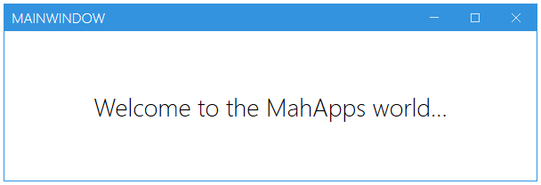
Normal Border
A window with a normal border can be achieved by using the BorderBrush and BorderThickness property.
<Controls:MetroWindow x:Class="MahApps.Metro.Simple.Demo.MainWindow"
                      xmlns="http://schemas.microsoft.com/winfx/2006/xaml/presentation"
                      xmlns:x="http://schemas.microsoft.com/winfx/2006/xaml"
                      xmlns:Controls="http://metro.mahapps.com/winfx/xaml/controls"
                      Title="MainWindow"
                      Height="200"
                      Width="600"

                      BorderBrush="{DynamicResource MahApps.Brushes.Accent}"
                      BorderThickness="1"

                      WindowStartupLocation="CenterScreen">

</Controls:MetroWindow>
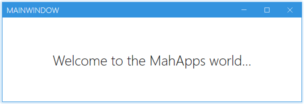
Glow Border
A window with a border glow effect can be achieved with the GlowBrush property.
<Controls:MetroWindow x:Class="MahApps.Metro.Simple.Demo.MainWindow"
                      xmlns="http://schemas.microsoft.com/winfx/2006/xaml/presentation"
                      xmlns:x="http://schemas.microsoft.com/winfx/2006/xaml"
                      xmlns:Controls="http://metro.mahapps.com/winfx/xaml/controls"
                      Title="MainWindow"
                      Height="200"
                      Width="600"

                      GlowBrush="{DynamicResource MahApps.Brushes.Accent}"

                      WindowStartupLocation="CenterScreen">

</Controls:MetroWindow>
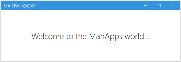
Only Shadow
The window can also used without a border to get only a shadow arround it.
<Controls:MetroWindow x:Class="MahApps.Metro.Simple.Demo.MainWindow"
                      xmlns="http://schemas.microsoft.com/winfx/2006/xaml/presentation"
                      xmlns:x="http://schemas.microsoft.com/winfx/2006/xaml"
                      xmlns:Controls="http://metro.mahapps.com/winfx/xaml/controls"
                      Title="MainWindow"
                      Height="200"
                      Width="600"

                      BorderThickness="0"
                      GlowBrush="Black"
                      ResizeMode="CanResizeWithGrip"

                      WindowTransitionsEnabled="False"
                      WindowStartupLocation="CenterScreen">

</Controls:MetroWindow>
Properties
One property not detailed is the SaveWindowPosition="True|False" (default False) option. Setting this property to True will mean on next launch, it will automatically be positioned and sized to what it was on exit. This is designed to improve UX and speed development as its one of those "plumbing" UI things that is done regularly.
Be careful though - if a monitor is detached during application exit and restart, or if certain circumstances arise, your application may launch off screen. Be sure to provide a 'reset' option or handle that in code.
Setting a custom Icon
Note
The Icon-Property can only contain content of type ImageSource (see Microsoft Docs). To show other content we have to use the IconTemplate
You can adjust the appereance of the Icon by editing the IconTemplate. The below code snippet shows how to configure the Icon-Image:
<mah:MetroWindow x:Class="MetroDemo.MainWindow"
                 xmlns="http://schemas.microsoft.com/winfx/2006/xaml/presentation"
                 xmlns:x="http://schemas.microsoft.com/winfx/2006/xaml"
                 xmlns:mah="http://metro.mahapps.com/winfx/xaml/controls"
                 Icon="mahapps.metro.logo2.ico"
                 ShowIconOnTitleBar="True">
    <mah:MetroWindow.IconTemplate>
        <DataTemplate>
            <!-- Setting a Margin and enable hight-quality image -->
            <Image Margin="4"
                   RenderOptions.BitmapScalingMode="HighQuality"
                   Source="{Binding}" />
        </DataTemplate>
    </mah:MetroWindow.IconTemplate>
    [...]
</mah:MetroWindow>
You can also use any other content here as well. In the following snippet we will use an icon form the MahApps.Metro.IconPacks but you can use any other content as well.
<mah:MetroWindow x:Class="MetroDemo.MainWindow"
                 xmlns="http://schemas.microsoft.com/winfx/2006/xaml/presentation"
                 xmlns:x="http://schemas.microsoft.com/winfx/2006/xaml"
                 xmlns:iconPacks="http://metro.mahapps.com/winfx/xaml/iconpacks"
                 xmlns:mah="http://metro.mahapps.com/winfx/xaml/controls"
                 ShowIconOnTitleBar="True">
    <mah:MetroWindow.IconTemplate>
        <DataTemplate>
            <iconPacks:PackIconUnicons Kind="BatteryBolt"
                                       Width="30"
                                       Height="30"
                                       HorizontalAlignment="Center"
                                       VerticalAlignment="Center"
                                       Margin="4"
                                       Foreground="{DynamicResource MahApps.Brushes.IdealForeground}"/>
        </DataTemplate>
    </mah:MetroWindow.IconTemplate>
    [...]
</mah:MetroWindow>