The SplitButton controls is like a button with a drop down list, but the content of the button will be changed when selected item is changed.
SelectedItem and SelectedIndex
This properties usage is just like in Listbox or ComboBox. When one of this properties changed, Content of the button will also changed.
Binding to ObservableCollection or Dictionary
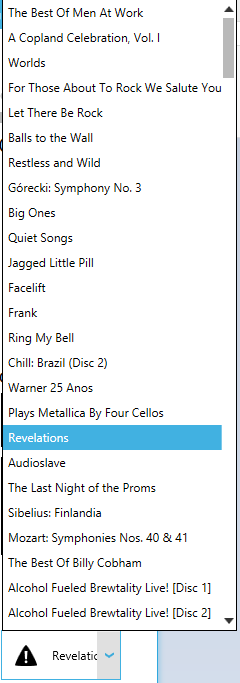
To correctly bind an ObservableCollection or a Dictionary to SplitButton, you need to use ItemsSource and DisplayMemberPath
For ex, ItemsSource="{Binding Albums}" DisplayMemberPath="Title"
In case you bind simple types like an enum or integer, you don't need to use DisplayMemberPath property, only ItemsSource.
Orientation
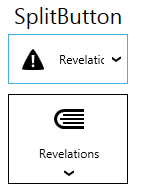
SplitButton supports orientation changing as you can see on the screenshot.
Button commands
You can use button commands for SplitButton
Icon property
You can add separate icon to SplitButton to display it independently from its content.
<mah:SplitButton Margin="5"
                 HorizontalContentAlignment="Left"
                 Command="{Binding ArtistsDropDownCommand}"
                 DisplayMemberPath="Name"
                 ItemsSource="{Binding Source={x:Static models:SampleData.Artists}}"
                 SelectedIndex="2"
                 SelectionChanged="SplitButton_OnSelectionChanged">
    <mah:SplitButton.Icon>
        <iconPacks:PackIconMaterial Margin="6" Kind="Audiobook" />
    </mah:SplitButton.Icon>
</mah:SplitButton>